Tuesday, 29 September 2015
Friday, 25 September 2015
Lighting
Lighting

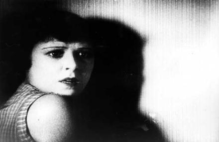
In the case of this still, low-key lighting can be said to have been implemented. This can be said since although strong levels of light are visible in it such as on the side of the woman's face in particular, there is still quite a strong presence of dramatic shadows, often referred to as chiaroscuro. Additionally, there is quite a strong contrast with the smoke coming from what appears to be a cigarette between the fingers of the woman and the woman herself. This use of lighting here almost enshrouding the woman in a veil of mystery, helps add to this idea of her possibly being a femme-fatale character.
With this still low-key lighting is again used, however along with this top lighting is put into practice. While this is frequently used in order to make a character appear more glamorous by showcasing their facial features, in this case it's used to make the character look more dramatic. Since there's such a strong contrast present in the still (chiaroscuro), the only place where attention is really drawn to are the facial features of the woman, in which she appears to be particularly concerned with something.
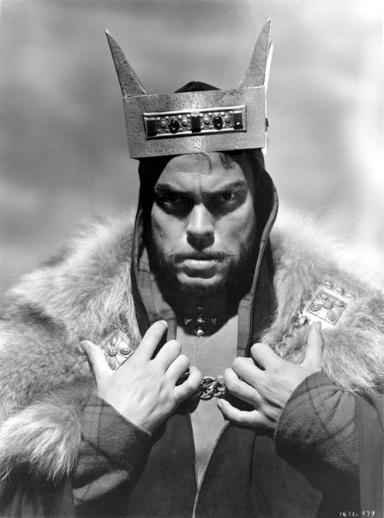
This still of the individual who looks to be a monarch uses high-key lighting in addition to back lighting. With not a huge amount of contrast between light and dark, the lighting in this still is effective in making him look like a character of importance/significance as the crown he's wearing also connotes.
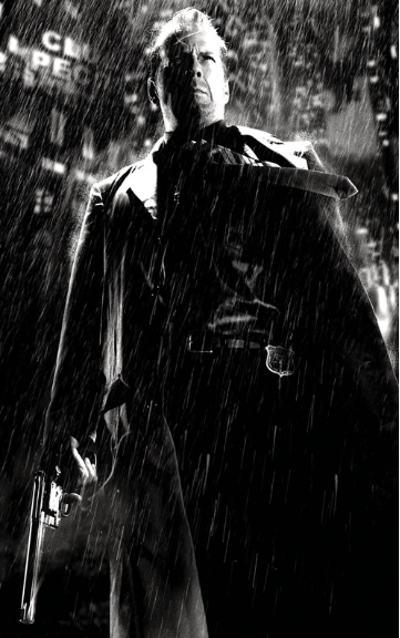
This fourth still image uses low-key lighting. Here it helps create strong, dramatic shadows on the character. Additionally, the use of top and back lighting emitting from what appears to be city lights, help create quite a dramatic undertone perhaps in suggestion to the underworld of society. What's also apparent is the firearm being held in the hand of the character which appears to be more brightly lit than the character himself This focus on the firearm helps make it appear as maybe if not as important, almost more important than the character in the still himself, perhaps suggesting a 'live by the gun, die by the gun,' criminal lifestyle.
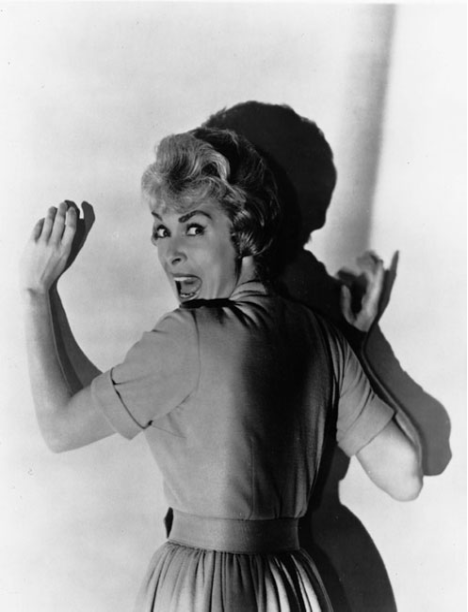
The fifth still employs more low-key lighting. By doing this a dramatic shadow is produced of the character herself, adding to this idea of her facing impending doom as her frightened facial expression already suggests. Also with the character and her shadow via low-key lighting the only things actually visible in the poster coupled with her facial expression, a sense of mystery is created as we as viewers are totally unaware of what exactly the woman may be showing fear towards.
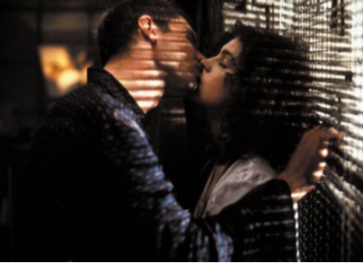
This still puts quite high-key lighting into use. With it being set in what looks like a reasonably dark room with the only source of light coming from the blinds on the right side of the image, the still produces a more realistic effect for the scene. This use of darkness bar the light shining through the blinds also helps portray the scene as a more intimate and private moment, as suggested by the kissing of the two characters.

This picture here adopts low-key lighting. As well as back lighting to help produce silhouettes/shadows of the characters, the low-key lighting of this still means that no specific features of the 4 characters in the centre of the still are actually distinguishable. However in the bottom-left corner of the image there's a silhouette of an individual flat out on the floor, with what looks like something going through his head. This creates a more menacing aura around the 4 standing individuals, as if they were responsible for whatever may have happened.
This still here uses low-key lighting and back lighting. Similarly to the fifth image, the only things present in this still are the character and her shadow, possible through the contrast and dramatic shadows with low-key lighting. Additionally with the light shining on the face of the woman, underlighting could have potentially been employed in order to add to a more ominous feel to the scene.
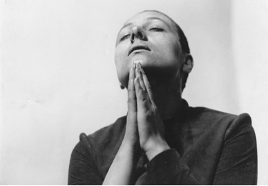
This image here uses high-key lighting. With the still appearing to be a lot more natural looking than most of the other ones, perhaps what's meant to be achieved in this is for the viewers to be empathetic towards the character since she may be going through quite a lot. This is also suggested by her hands appearing as if she's praying to God.
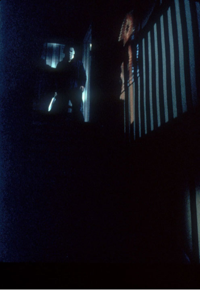
In this still, low-key as well as back lighting can be said to have been used. With it looking like something from a horror movie, the still helps present the character who looks like he's on top a staircase as something of a predator as he stands. As well as this, the complete darkness at the bottom of the image through the low-key lighting make the character of the top of the stairs look as if he's going to the 'deep depths' of a basement, again key iconography of a horror film.
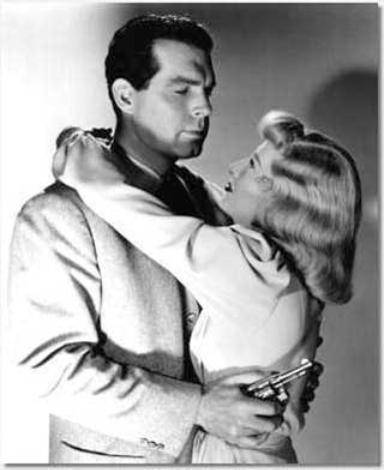
In this last still, high-key lighting is used. Although shadows are created, they are in a way that a contrast between light and dark isn't completely jarring. In addition to this, top lighting is used as a way of presenting both characters as glamorous and perhaps quite stylish, particularly for the time period.
Friday, 18 September 2015
Mise-en-scene
Mise-en-scene

The above still is from the drama series 'Youngers,' in which three South London teenagers set out to make it big in the music industry. In terms of what can actually be seen from the still though, one of the things that can be immediately commented on is the actors in it. With all three of them looking like your typical (London) teenagers with one donning a hoodie and another a particularly colourful jacket, apparel synonymous with the juveniles of nowadays, the setting is also essentially established as being in a more urban area; the city. From a prop standpoint, one of the key ones is the piano being held by the actor in the centre. This of course relates to this idea of their road towards success in the region of music. However, their facial expressions in the photo don't suggest that this road is going to be necessarily smooth by any means and actually, they look disappointed and downhearted of course suggesting that it'll be a struggle to get to where they want to. It could also be noted that top lighting is used in the still as a way of rather than making the actors look more 'glamorous,' showcasing their frustration with whatever may have happened in the previous scene instead.
Boyz N The Hood
https://www.youtube.com/watch?v=BadSZDpvq-s
Captain America: The First Avenger
https://www.youtube.com/watch?v=Q9HCqnBcm8M
The mise-en-scene of each of the three film clips is vastly different to each other. Although they share some common factors such as all of them being set predominantly in the USA and in the past with 'Straight Outta Compton' being set during the 80S, 'Boyz N The Hood' also in the 80s/90s and Captain America going as far as the 1940s, what's shown to viewers is drastically different. In 'Straight Outta Compton' for example, the scene is set in a studio in which the atmosphere is one of rebellion and also high levels of energy against the police. They're also almost all wearing snapback caps fitting in with the setting with one of them reading: 'Compton.' Other props in the video also include the devices in the studio and the book Ice Cube hands to Eazy-E filled with the lyrics of the song they would go on to record. However this is quite different from the environment in 'Boyz N The Hood' which although being set around the same time and nation, is in an entirely different place. Being set in an African-American ghetto as oppose to a recording studio, the atmosphere in this clip is to some extent sombre revealing as to what the ghetto actually holds in its entirety when looked at from another point of view. In terms of the actors there, Laurence Fishburne acts as a almost a father figure (to some extent alluded to in his clothing) to the the two other youngers individuals in the video as he informs them on the process of gentrification. His mood reinforces the seriousness of what he's discussing and the severity of circumstances where they're living. However the deepest contrast is shown in Captain America with it being set in a military training boot camp.
Tuesday, 15 September 2015
Film Poster Analysis
Film Poster Analysis

Blade Runner
In this poster for the film 'Blade Runner,' what's initially identifiable is its generic conventions which pertain to that of the sci-fi genre. With the presence of what appears to be a form of spacecraft, a shining star in the background in addition to what appears to be a futuristic pistol prop in the hands of the (supposed) protagonist, it's suggested that this film takes place in if not outer space, then a futuristic rendition of the Earth. Things such as the back light behind Harrison Ford from what appears to be a star not only add to the idea of the film belonging in the sci-fi genre, but also help present him as somewhat of a saviour in regards to whatever predicament he may be facing as suggested by the tagline in the top right corner which says: 'MAN HAS MADE HIS MATCH ...NOW IT'S HIS PROBLEM.' Also with him 'making his match,' the concept of the creation of an android/robot or clone is brought about, adding to this idea that the film takes place in a futuristic setting. Adjacent to Ford, is also a woman with a cigarette in her hand placed in front of a black backdrop which has connotations of a femme fatale character synonymous with the film noir genre. With this it can be assumed that she may act as almost a temptation to the protagonist as the film progresses, similarly to other films in the genre. This said, the film appears to be in that of a hybrid genre of film noir and sci-fi, perhaps appealing more towards an urban, middle-class arthouse audience due to its more abstract nature through things such as its fusion of genres.

Scary Movie 2
In the 'Scary Movie 2' poster, what's immediately apparent is that the film appears to a parody of films in the horror genre. With one actor in the poster wearing a poster with the statement 'I LOVE DEAD PEOPLE' and a critic regarding the film as 'Absolutely Hilarious,' it's apparent that this film isn't the 'scary movie' that its title suggests it to be and actually, the movie directly makes fun of other actual horror movies. This is further suggested by the tagline 'More merciless. More shameless,' showing that rather the film be focused on pure scares alone, its intention is to also make it viewers laugh repeatedly who would also tend to be people of a more younger demographic (young adults and/or teenagers) suggested by the actors in the poster. With this said, this film can be considered to be more of a comedy than a horror film with it being a parody of horror adaptations and so might also be considered to be a hybrid genre of comedy and horror.
Uzak
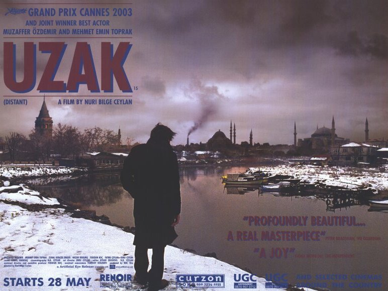
The poster for 'Uzak' is slightly less clearer than the previous two posters in regards to what the film is actually about. The lone individual in the foreground of the image who appears to act as the central character for the film appears as if he's going on a quest or has something he needs to fulfill, as he looks overlooks what looks like a Turkish skyline. Also the coat that he's wearing in the poster connotes that he's not exactly a rich man by any means and that he's looking for an avenue of opportunity, which is quite reminiscent of the concept of the 'American dream.' Additionally, elements such as the snow, dark body of water and nebulous sky all contribute to a sombre and stagnant atmosphere which may represent the fact that his goal, whatever it may be, will be difficult to achieve as he faces obstacles throughout his journey. Overall, it appears that this film is likely to be in the drama genre for its darker tones and also be targeted to a more older demographic who perhaps go to independent cinemas (arthouses) and have an interest in international films which can be inferred by the title of the film, which clearly isn't English.
I'm Not Scared
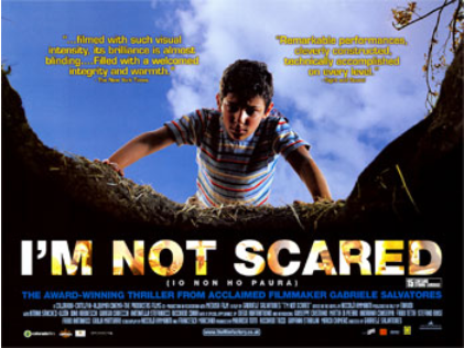
This poster for 'I'm Not Scared,' is less vague than the one for 'Uzak' in terms of what the film is about. One thing to comment on immediately is the look of despair on the boy's face as conveyed with the low-angle shot. As he looks into whatever is in the hole, he seems scared of what he has discovered. The shadow cast over his face adds to this idea of him being shocked by what he has seen and for this, it can be assumed that the film is a thriller. However, another thing to note is the contrast present in this poster with the boy's seemingly worried expression and the blue sky behind him perhaps representing the fact that other people in the vicinity of the hole are in the dark about what it actually holds. Either that, or the hole is for the most part hidden from most [people]. The target audience of this film can be assumed to be again, those that frequent independent cinemas due to it being an international film indicated by the text in another language below the title.
Sin City
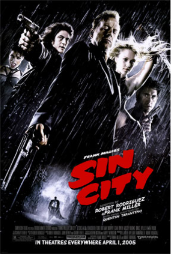
'Sin City' appears to be a film that borrows generic conventions from the film noir genre. This is firstly apparent by the use of the black and white colour scheme in the poster. The black-and-white visuals is something that is often associated with the film noir genre so this was already a telltale sign of it. Not only this, but the presence of a gun-toting male in the forefront of the poster, suggesting he's a central character for the film, alongside a blonde, to some extent scantily clad woman all tick the boxes of a production in the film noir genre. The low-angle shot presents all 5 of the characters on the poster as quite menacing, and this is further aided by their brandishing of firearms. For these explanations, this film will predominantly be watched by a more adult audience due to the violence and sexual content present in this genre of film.
Pirates of the Caribbean: Dead Man's Chest
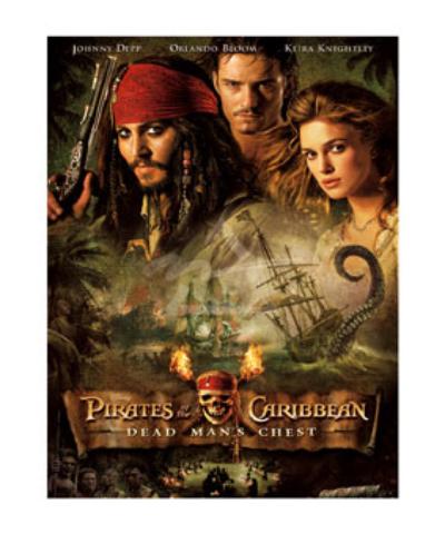
'Pirates of the Caribbean: Dead Man's Chest' virtually immediately strikes as an action-adventure film. As the very title suggests, the film stars buccaneers who quite conventionally in regards to pirate films, go on a search for treasure. The mise-en-scene in the poster further supports this with one of the actors branding a bandanna and flintlock pistol prop in his hand, along with the ship in the centre of the poster. These all help contribute to this idea of piracy, and with the determined looks on the faces of the three (main) actors on the poster as if they're driven to obtain this referred to treasure, it's not wrong to assume that this film is in the action-adventure genre based around pirates. The target audience for a film like this is likely teenagers up to adults simply as a result of the fact that the film is likely to contain slightly more violent scenes as apparent with props such as the pistol in the hand of Johnny Depp.

Bride & Prejudice
The poster for 'Bride & Prejudice' presents the film as being a parody of 'Pride and Prejudice.' The tagline suggests that the film is a romantic comedy where the two actors in the forefront of the poster are supposed to get married. In the background, celebration is visible with confetti and a congregation of people most likely directed at the bride and groom to be, and also the temple in the background suggests that the film is set in India. Also, the blue sky in the background of the poster conveys the idea that this film will be generally happy like the tagline suggests and not be contrasted/juxtaposed by anything whatsoever. With the film seemingly taking place in India, the target audience is most definitely going to be those with Asian heritage across all age groups due to its overall relatability and the more comedic nature of the movie.

Million Dollar Baby
'Million Dollar Baby' isn't completely clear in what exactly its plot may entail. From what can be seen from the poster, it's apparent that the central actor will be heavily involved in sports with what she's wearing. The dark shadows cast over the three actors suggest that the film will be one where difficulty is abound perhaps as she progresses throughout her sporting career, with both of the actors on either side of the poster sporting expressions of distress and worry, perhaps suggesting the film is a drama. People watching this film are likely to be adults with one indication of this being the shadows, maybe connoting that the film will have a more darker and serious tone in the entirety of the film and not ease to allow younger viewers to have to chance to fully enjoy (and comprehend) it.
Subscribe to:
Posts (Atom)