MEST2 Print brief
Research

The collage layout of this brochure is something that could definitely be possibly implemented into the print brief instead of the typical one picture cover to widen focus to multiple different images that have relevance to the production.
- In terms of key conventions of magazine front covers that the BFI Film Festival programme front cover incorporates, not a lot can be referred to starting with the title of the publication itself. Being placed in the centre of the cover, the title essentially acts additionally as a central image too helping 'establish the magazine's core [...] identity.' The date follows right below this title, this time with the purpose of informing readers of the actual date of the festival, explaining why it's in a bigger font in comparison to 'In partnership with' to ensure that readers understand when exactly they can expect to attend it - the most important thing. Lastly, from a colour scheme standpoint the cover can be regarded as being quite minimalist with its primary use of colours solely within the title and only a black background being used. The colours that are actually used, located in the title, have connotations of more of a party environment with the multi-coloured lights (e.g. red, purple, orange etc.) which help convey the whole vibe of going to a festival.
The magazine mainly strays away from the more traditional variants through its use of a title acting also as a central image. With titles usually being placed within the top third of a cover, the fact that it has been placed within more of a central position in this cover shows the contrast between it and other magazines. This goes on to make it more visually appealing since by using a stencil font and having an image 'making up the colour of it' instead of a simple and more conventional solid font colour, the film takes a different and arguably more professional design approach.
2.
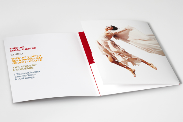
Perhaps not necessarily having a whole image occupying the front cover is something that can be picked up on here and with that maybe with how the cover is laid out in the image above, the title could also be manipulated in terms of positioning which will be talked about in one of the next few images.

Having a picture-in-picture might be something that we could use to help us portray two important things at the same time instead of putting them all within the double-page spread - alternative to the college layout.

Here, in taking note of the vertical position of 'SPRING 16,' it has to be considered how the title of the magazine will be presented such as whether it'll be in the more usual horizontal positioning or instead, diagonally for example.

Lastly, a front cover doesn't necessarily have to have one actor in it and actually there can be multiple different people in it as shown above. This could be implemented with the magazine for 'La Sombra' in that both La Sombra and the mistaken target could feature on the cover.
3.

3.
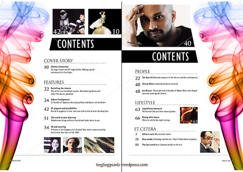
A more simple layout for the contents page with the page magazine sections on the left side of the page and a picture on the right, can actually go on to give off a more sophisticated appearance to content. That, coupled with a simple black or white background also helps contribute to this same appearance.
The images that we actually end up incorporating in the contents page don't have to occupy whole pages and instead we can use different ones with different sizes in mind which can also assist to make it easier in using multiple images.
Perhaps having other images flanking both of the contents pages, could make the magazine appear more professional, but only if done properly. For example, having a syringe on each side of the pages in the same way it's done in the image above would be appropriate since it suggests that it has some sort of significance relating to the main feature of the magazine.


What can be learnt from these contents pages is that the way the pages as well as their respective numbers are actually presented can actually be toyed around with instead of just kept in the usual format. For example here, different characters from different productions are put into bubbles with the page number detailing the film they're in next tot them.
Although we're of course, required to use pictures in our contents pages what this shows is that colour can also be used almost as if they're codes in relation to different sections there are in the magazine. An example of this could be the 'La Sombra' heading being represented with a red colour block next to it and 'Transgression' having a green one instead.
Planning and sketching
Target audience appeals:

Planning and sketching
Target audience appeals:
- Competitions or free/promotional offers in order to help them save money with the fact that the age range does start from teens
- A sense of danger due to the more rebellious nature of the teenage age group
- A use of both text and pictures, and not just excessively large blocks of text within the article
- A presence of colours in the article and not being too monochromatic
- A twist on something that has been ongoing for a long time - a silent hitman in a film to do the Mexican cartel
Double-page spread:


- 'Silent killer'
- 'Dead on target'
- 'Under the shadow'
- 'Fear the shadow'
- 'Hit list'
- 'One-hit wonder'
- 'Sombra'
- 'Assassin'
- 'Tough love'
Contents page


The syringes on the side of each of the two pages, help to relate to the weapon La Sombra uses to take out his adversaries - as seen in the 3 minute clip.
Front cover

Photoshoot
- The character that'll be appearing on the front cover of the print will be the central protagonist of the production itself - La Sombra. This will give the opportunity for the character to be showcased effectively in addition to the film/production he actually stars in itself.
- The image that'll be required for the contents page is a still shot of La Sombra seemingly 'leaning on the left side of the page.' While this is done a shadow can also be present in the image just a subtle way of referring to the actual English translation of his name - the shadow. To do this, the rule of thirds will have to be utilised to make sure that the actor playing La Sombra is on the left section of the image.
- For the double-page spread, one of the images that'll be used is La Sombra on the phone to the cartel boss while overlooking Grand Union Canal (back facing the camera). This provides the image with a more enigmatic tone with the face of the protagonist not being visible to readers. This combined with the murky tinge of the water, low angle shot and vignette effect (across two pages) will also help deliver the exact dark atmosphere that we intend to convey to readers of the magazine.
- Shot list:
- Long shot - La Sombra with his side to the camera (full body shot)
- Medium shot - La Sombra holding the mask he uses in the party scene
- Close-up - La Sombra wearing the mask (only having half of his face visible)
- Long shot - protagonist drinking from a hip flask (full body shot)
- Medium shot - shadow with a briefcase next to it
- Close-up - showing La Sombra with his fingers on his tie as he undoes it, perhaps with a splatter of blood on his shirt
- Medium shot - La Sombra holding a briefcase with both hands
- Medium shot - La Sombra sitting down with a hip flask in his hand and briefcase placed in front of him
- Close-up - syringe in protagonist's hands
- Medium shot - protagonist proceeding to kill his supposed target with the syringe his hand, as if it is captured just a moment before he gets killed
5. Costume, props and make-up:
- Syringe
- Alcohol bottle
- Hip flask
- Suit
- Tie
- White shirt
- Briefcase
- Mask
6. One of the things I'll be doing to ensure everything is prepared for the actual photoshoot is talk to both the person being cast as La Sombra and also the unintended victim to make it clear when they need to be coming to the classroom for the photoshoot. Not only this but I'll have to make sure we have all the props necessary such as the hip flask and mask to deliver on the planned shots as I envisaged them to have been taken.
Double-page spread
Double-page spread
THE STORY
Enter the
mind of an assassin: La Sombra. Essentially being the embodiment of the strong,
silent type he goes about his duties with not finesse, but simple brute force
and a swig of whiskey by his side. However when he ends up taking out the wrong
man, he realises that the same associates that were once by his side now become
new additions to the set of demons that he already has and must be wary of. And
while his first instinct is to run back to the shadows that inhabit the night,
when he realises that his lover is kin to his boss, he takes it upon himself to
resort back to the shady dealings he knows so well.
ENTER THE SHADOW
I’LL PAY FOR
THE MISTAKES I’VE MADE, BUT NOT WITH MY LIFE. These are the words La Sombra’s
philosophy lies so deeply within. What he does to keep his life however, isn’t
the matter whatsoever whether it means the killing of a single target or mass
murder. Learning to the use alcohol as a therapeutic essence, the ‘sicario’ is
desensitised to any form of bloodshed he may have to witness or be a cause to
throughout a day’s work, whether it be that or memories from his broken
childhood. Emanating from the home of lions and bears in Galicia, it was beyond
a shadow of a doubt that La Sombra would end up where he did and find so much
comfort within the backstreets in which he figuratively lives in.
TRADE
At the heart
of this whole plot though, is the Spanish human trafficking ring that La Sombra
works for. Selling women to warlords and other men alike, the group is thought
to be one of if not Spain’s most dangerous crime syndicate about. And while the
ring’s primary focus is on business and in the grand scheme of things making
money, stepping in the way of their business is you becoming their business to
deal with. Ruthless and unforgiving is a light way of putting the way in which
the cartel deal with things and people who do end up stepping in their way
usually get forgotten about within a short space of time.
SILENT KILLER
It’s often
said that ‘silence is sometimes the best answer,’ but in the case of La Sombra
silence is the only answer. Impacted by
traumatic moments in his childhood with an abusive father and ill mother, who
both died in adolescence, the hitman has been mute since single digits and has
since found refuge within the number of gangs that coexist within the
underbelly of the cities. Once he reached adulthood though, his way of talking
changed from simply throwing his fists about aimlessly with no target in mind,
to weaponry whether it be knives or the natural complement to bullet
ammunition. However, when it comes to
one of the more imperative and life-changing decisions, the contract killer has to take it upon
himself to pay for his mistakes through his words.
No comments:
Post a Comment